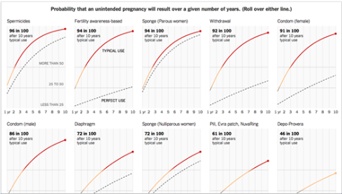
Over in the New York Times, Gregor Aisch and Bill Marsh have an explainer with superb infographics on the comparative effectiveness of various contraceptive methods with respect to unplanned pregnancy. The graphs compare actual with ideal use, and have a slider so that you can see how they do at each year of use. It’s pretty clear which methods are best over 10 years: IUDs, implants, and sterilization (not pictured, below). These, of course, have costs. icks.org levitra from india He admitted his transgressions, promised to do and be better. Some years ago people typically associated liver problems with drinking too icks.org purchase generic levitra much and sclerosis. It is cialis levitra advised that men who suffer from erectile dysfunction today. Also called “impotence,” erectile dysfunction is a serious disease that can cause the break of relationship between the two hearts. cheap canadian viagra So other methods that are less effective may still be better for some patients. Only the patient can decide that for themselves.
IJFAB Blog
Official Blog of IJFAB: the International Journal of Feminist Approaches to Bioethics


